28 March 2010

Final Cut

This is the final product of our Thriller opening.


The only origional sceens we used was the opening shots fading gradually into the woods to introduce the setting.

09 February 2010

new plan

http://www.dafont.com/font.php?file=bleeding_cowboys&page=1&nb_ppp_old=10&text=Decade+Late&nb_ppp=10&psize=l&classt=alpha
This is the new text font we have decided to use, it looks slightly western and partly horror style.
We have decided to rename our title : Decade Late
indicating in the title that the female antagonist is getting revenge on the teenage girl for something she did many years ago. Possibly an insignificant event that has worked up in this paranoid psychologically disturbed woman's head until she wants to bring harm to this helpless girl.
This was the new shot list we created for our next shoot
1. arch of trees with titles on top
2. further into the woods
3. LS of victim lying on the floor
4. tree with titles, then track 180 round the tree to find antagonist sharpening knives
5. LS of victim on the floor with antagonist in the foreground
6. ECU of gagged mouth with antagonist's feet in the background
7. pan to teddy thrown on the floor

Media coursework editing

On tuesday 9th feb we spent the whole day focusing on how to improve our coursework. The first thing we questioned was "is it cliché?". The fact our piece is focused a lot on the woods with a girl tied up and flashbacks being dragged made us overlook the idea that there isn't much originality in our story line. We talked over many ideas on how to change the focus of the story to something better. We discussed the new edited rough-cut, and noticed that the flashbacks weren't obvious enough making the flow of the images unclear. We thought the slow continuos pace was effective, but when peers watched it they felt bored after the first two fades of the woods. From this we decided to cut the 45second introduction of setting the wood scene to just two or three 5second fades.
This cut our time length greatly and had
to re-think how to produce an effective two minut
es. We were advised that we had to many repeated shots. Too many close ups of the hands and gagged mouth meant the had to change the focus somehow. We thought about more flashbacks following the story of how she got there more, but decided they weren't effective enough.
Our story is one of a Psychological Thriller, which restricts the amount of styles filming we achieved. We talked about combining two ge
nres, and decided a western thriller would work well mixing up the style of the story. Shots such as jump cuts from two characters in a duel would be converted to fast jump cuts from the an
tago
nist to the victim from their point of views.
It started to feel like we were changing our whole original idea so when back to thinking of the shots we already have available to use. The ones we liked best where the disorientating trees, and a e.c.u with the camera on the floor filming
the gagged lips. Because a lot of the shots were taken from a third person perspective,
we changed it to the perspective of mainly the antagonists. To stay away from the obvious, the antagonist is going to be female. Maybe a relative, or parent of one of the victims friends. Keeping with the 'teddybear picnic' juxtaposition of lively upbeat childhood movie while watching the thriller, we connected the reason for the attack to a repressed memory the antagonist has towards this girl from when she was younger. A tattered old toy bear is going to symbolical to the reason of her actions, how her
body is going to end up after the woman attacks h
er with the knife.
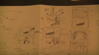
We created a new shot list and storyboard suggesting the new shots we need to organise to shoot. We have got a new actress, Louise Huntley, to be the antagonist, but we had a problem with the deadline and organizing a shoot. Because i
ts
a large last minute change, Jordan was unavailable to act, so we changed the victim to me so i can help and know exactly how we want the victim to act.

This is the brainstorm i created


This is the improved story board shots
03 February 2010

ILP plan

We are deiticating a day to editing our coursework so our group made a plan of what we want to achieve by the end of that day.
I looked at font styles for the title of our film opening on http://www.dafont.com/, and found a few we liked such as 'flour de laire' and 'ultimate black metal' which had horror looks to them.
We also re-thought the name of our flim because we were never happy with the title. e came up with 'hide and seek' but realised that is already a film, then 'autumn leaves' but didnt have the wow factor we were looking for.
While also looking for new music as a non-diagetic sound to create tension ontop of the film we got the tune 'Teddy bears picnic' into our heads. It would be a great juxtaposition of a thriller film with such an inocent title, and we developed it further untill we were happy with the name 'Down to the Woods'.
From here we also decided a little girl humming the tune to teddy bear picnic, but in minor, with little piano would be effective. The idea of singing ' if you go down to the woods today' as the title apears is an experiment we are doing to try out once we record the sounds ourselves. We also decided to try introducing a lo males voice humming under the girls to be symbolical to danger.

This is our achievement list:

- Discuss/re-write order of shots (what to keep/cut out)
- create title font desing and other titles (effect on title dissapearing - sand? )
- change the name?
- add zooms and flash and change colours on selection of shots
- plan to re-shoot tree's - sun - continuity
or darken other sunny shots..
- Blog the work achieved

Rough Cut

on Monday 1st Feb we handed in our rough cut of our Thriller opening. This is what we had developed so far...


Mr Mickey advised us on what could be improved for our final cut. We had some shots of trees prepared but hadnt had the time to sift through and edit them in time, so we ended up with just the shots of the girl in the order we'd chosen. We were advised to put our last shot, a long shot of the girl abanonded on the forest floor, at the start, so the viewer moved in on the situation rather than working from close-up first.
One of the shot we had edited was at a slant angle, so we had to fix it after realising you cant crop the image to an new position. The 'flashback' of the girl sipping wine didnt seem to fit fluently because it was from a different time as the other flashbacks, so we had to re-think wether we would remove this shot and replace the time with others we already had, or if we wanted to re-shoot a different situation such a 'flashback' of the girls body being dropped into it's current position by the intagonist.
The idea was to set the scene of woods, before the girl was introduced, which had not yet achieved but it worked well with the new plan to lead on to the L.S of the girl.
Another problem we came across was that one of our member of the group was away who has the music and the rendered version on thier USB, so the roughcut only had diagetic sounds. The sounds of the crows and morning birds gave me the idea to raise the volume when the music plays so the situation feels more real to the audience.

29 January 2010

Friday 29th

Due to the weather being cloudy, it got dark too early on Thursday, so i got up extra early on Friday to try and catch the morning light. Because the deadline for the rough cut is due in today, i had to film with the time we had, even though the weather was different to the first time we filmed. I am currently learning how to tint the colour of the film on Premier Pro so i am hoping the after effects will help keep continuity throughout the two minutes.

As it was raining i had to prepare myself with an umbrella to protect the camera. Although this was awquard to hold on my own it kept me dry too enabling me to stay out for longer. As it was early in the morning when i filmed, there was local dog walkers that interrupted my shots at times, so this ruined some of the shots. I had to re-adjust the camera stand many times because the floor levels were so uneven, as i noticed some of my filming was at a crocked angle.

It was harder than i thaught panning tree branches and had to practice this process several times to try and keep a steady hand. The camera stand legs got in the way when trying to shoot from worm eye view, but i overcame this by shortening the lenght of the back two legs so the camera didnt have to be tilted at such a low angle.